

Woway is a startup, an advanced automotive search engine and a website. At the moment the project is still in beta testing phase, that is why I can not show you all projects. Nevertheless this is one of my favourites designs and I wanted to share it with you!
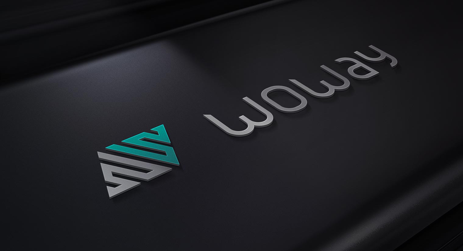
The logo is a combination of two „W” letters from the company’s name, the automotive symbol and dynamism (which is one of the most important values for Woway). The main idea was to connect all those aspects in one abstract, but still meaningful, form. Due to very sharp shape of the symbol I decided to design a custom font, so that the whole logo looks less aggressive (and keeps the modern style at the same time).