

Delayed airline passengers are entitled to receive compensation. A lot of them don’t know about that and neither do they know how to fight for their rights. It’s a long and complicated process . That’s why the Travel Compens website had to be designed to help passengers solve their problems in the best way. At the same time it was really important to give the lawyers in company all the tools they need to organize and manage detailed information about cases. Due to the lack of transparency in many competing sites, Travel Compens wanted to focus on solutions that will support the application process and make passengers aware of their rights.
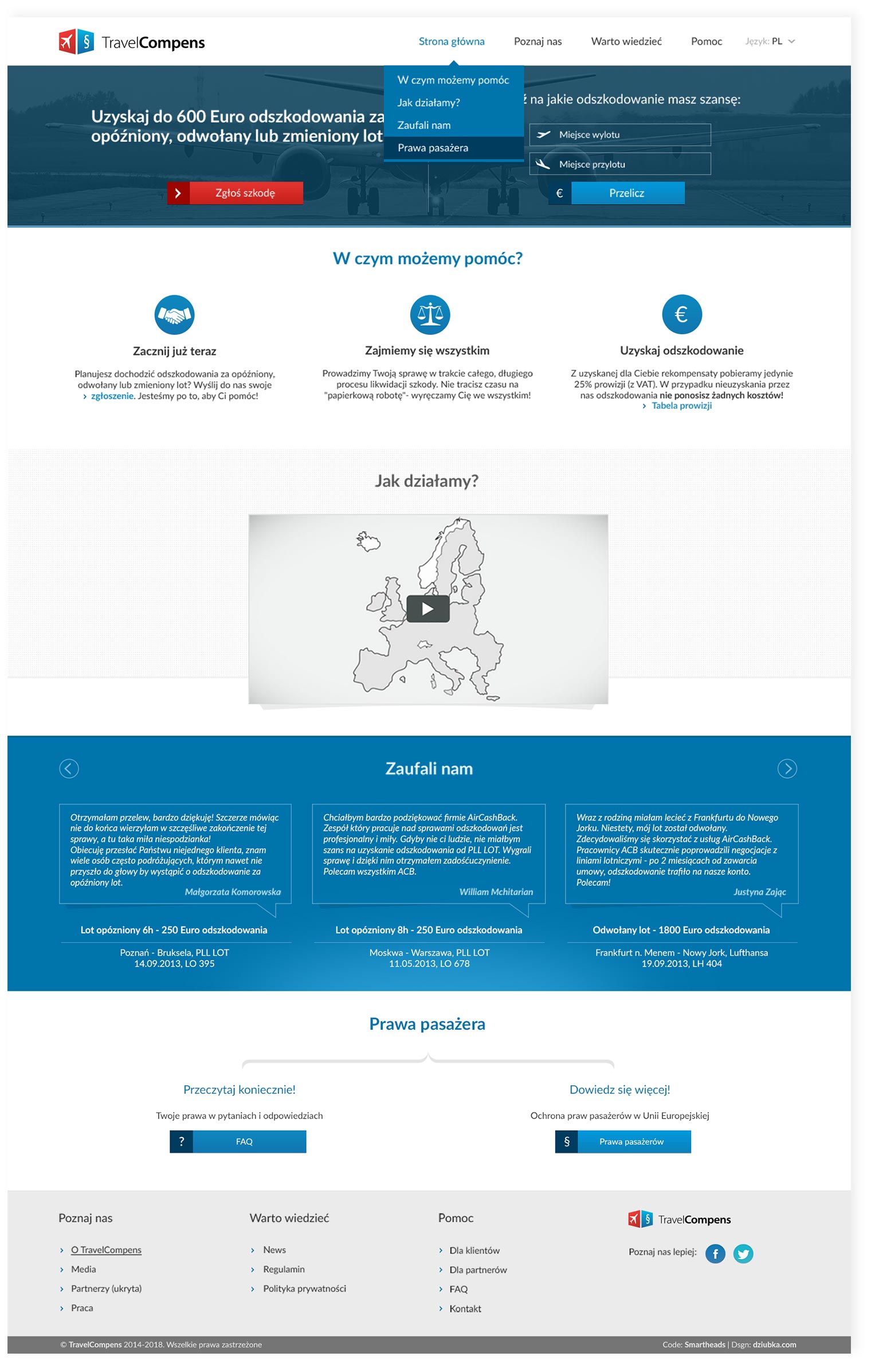
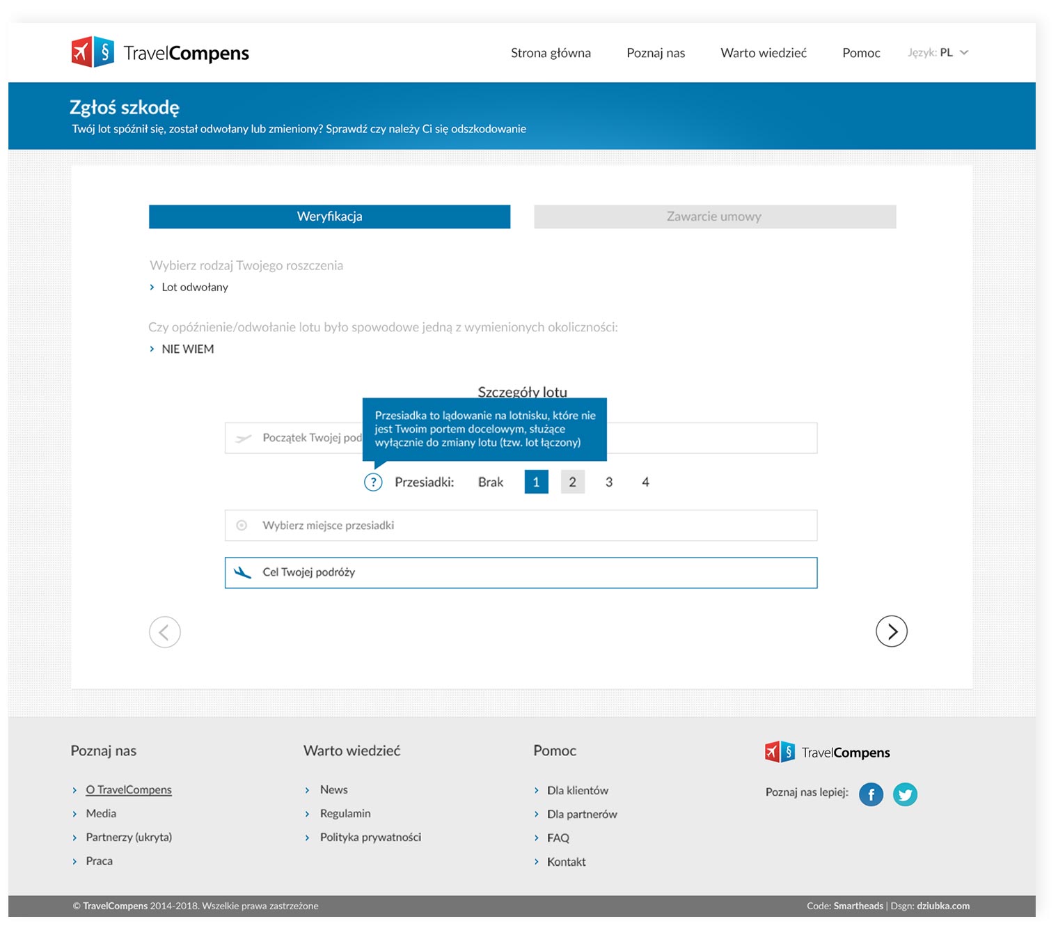
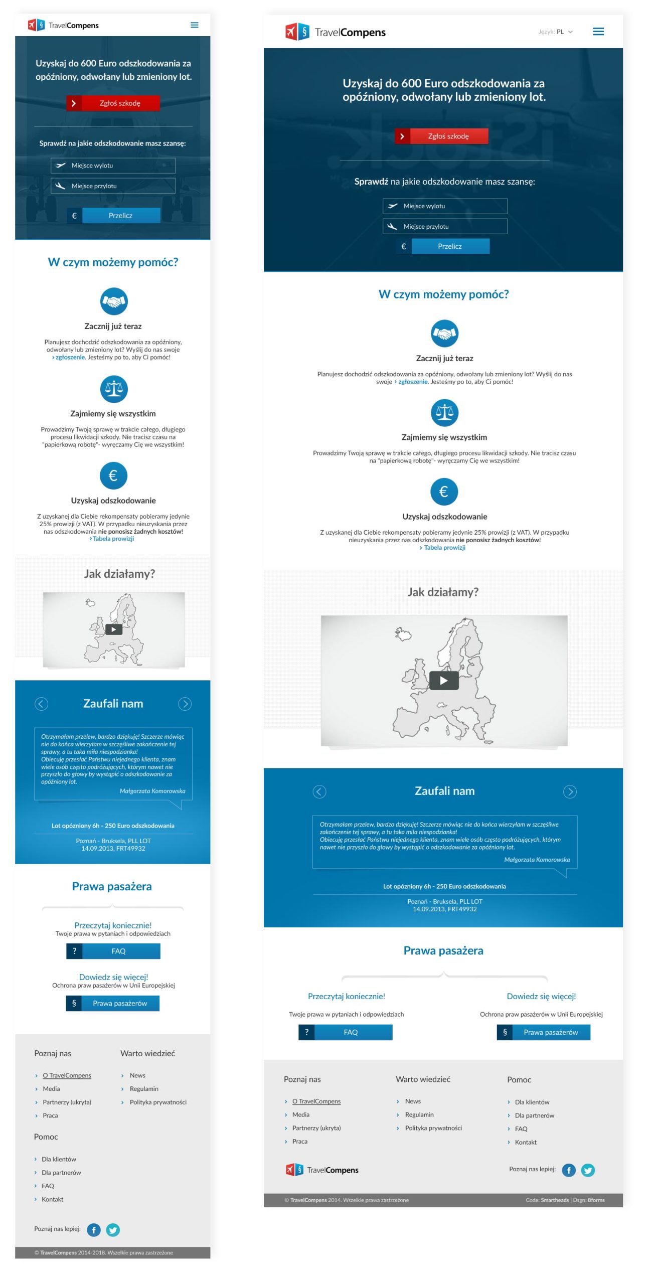
The main page is built on the rule of the “one scroll page” to show all important information in the easiest way. Compensation calculators encourage users to start the claim process. The animated movie below was designed to show in the easiest way how the whole process works. Detailed references build up users’ trust and important links help raise awareness of their rights. The information architecture and all the UX solutions were focused on usability and readability: making the design fully responsive and minimalistic. The big claiming module which stands on the website was designed by me to make this complicated process as user friendly as possible. Dozens of variables and details are provided by passengers in steps (with a lot of hints to help users to fill in the form). All kinds of travel and passengers’ configurations had to be predicted because many claims are about connecting flights for more than one person. All the data is processed to CRM as a readymade and legal claim form.