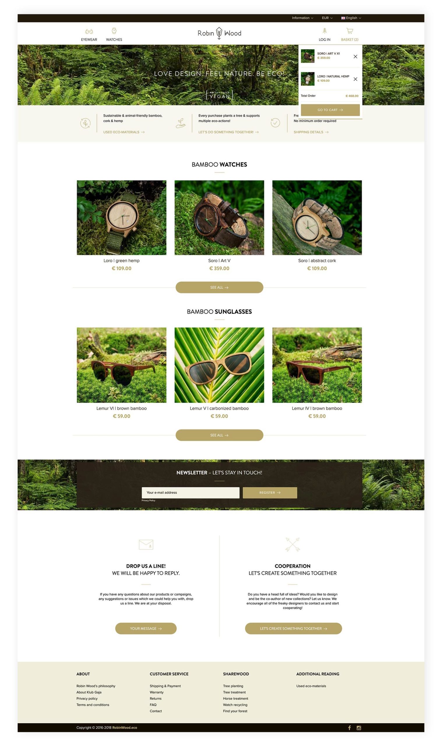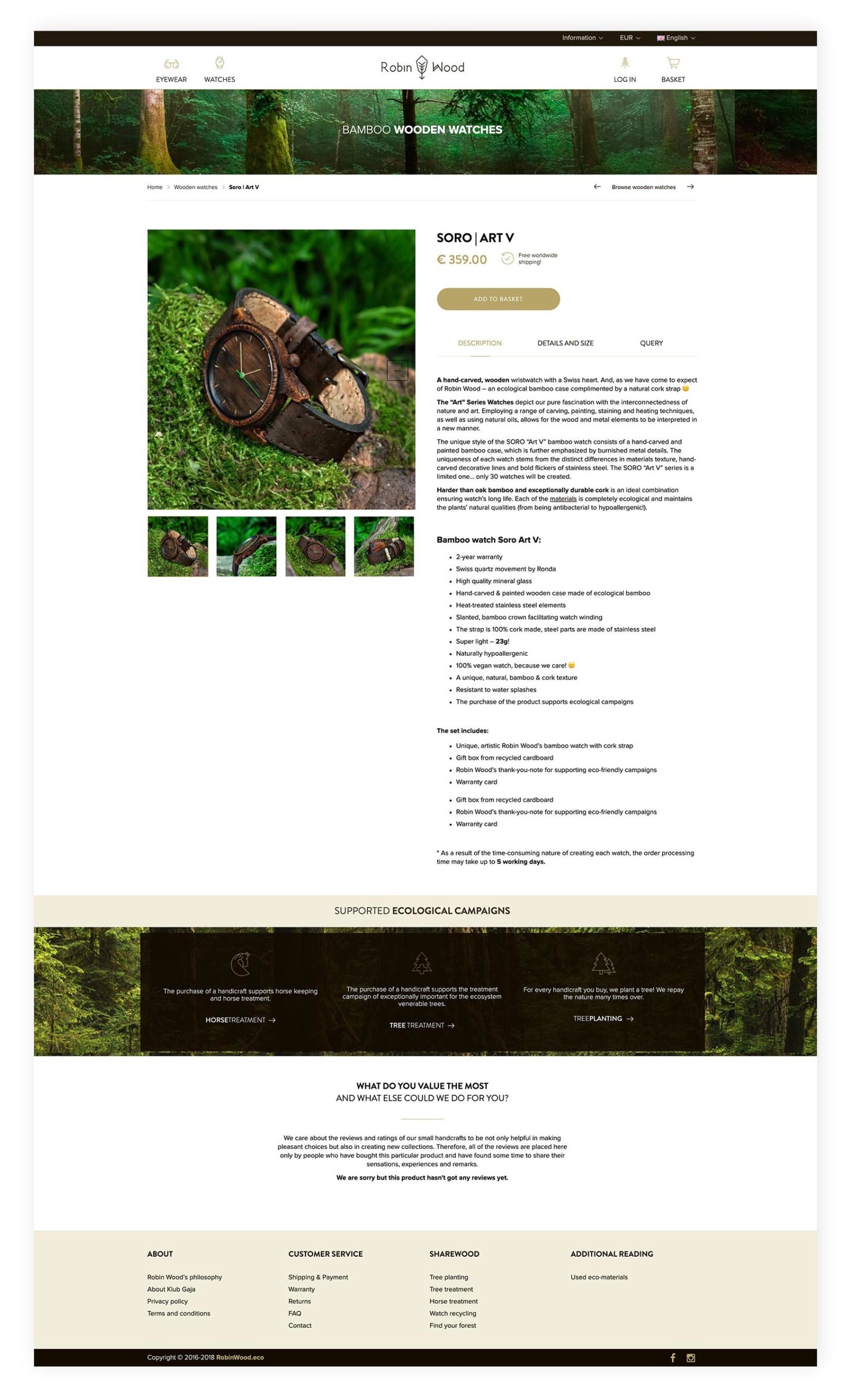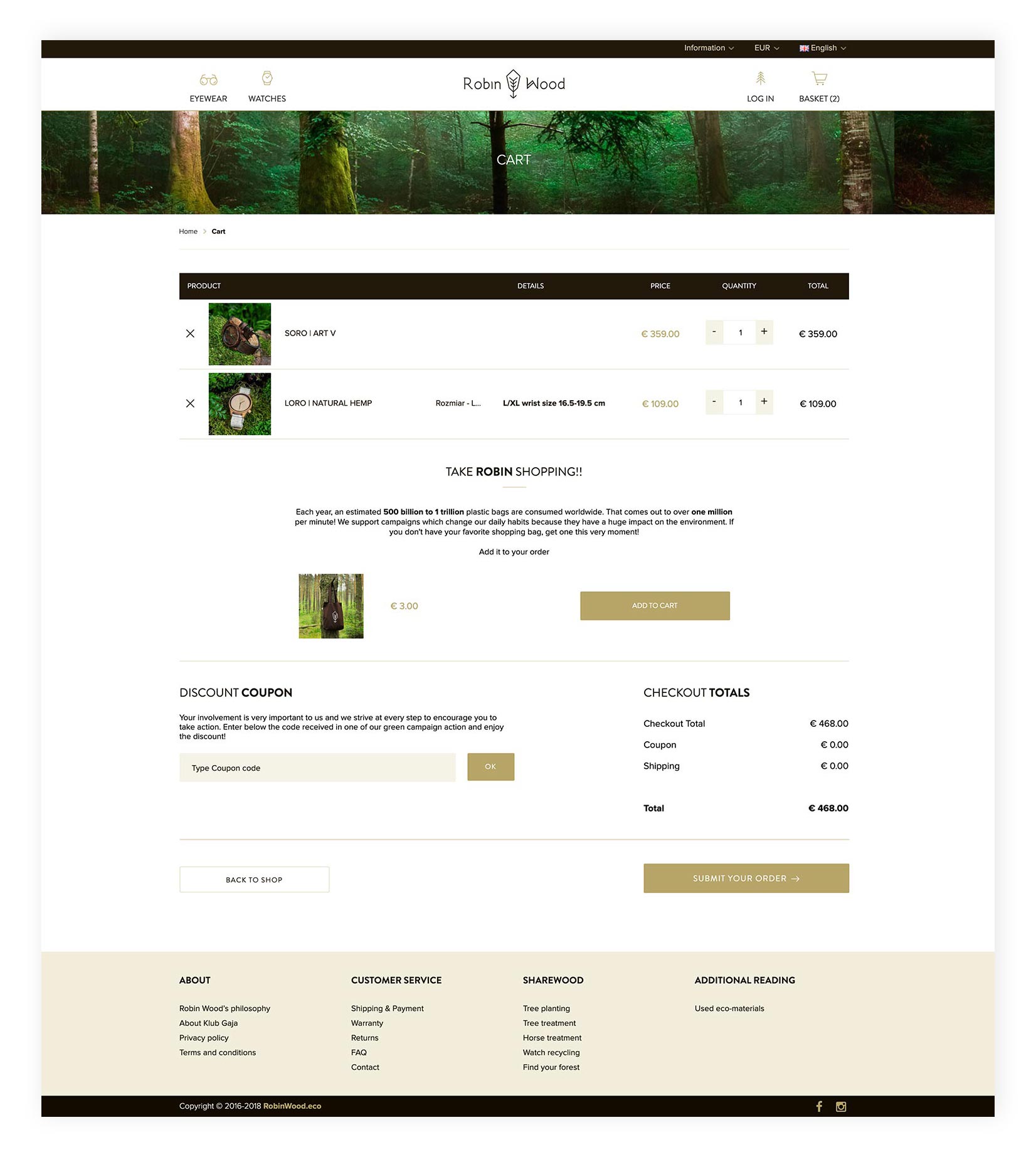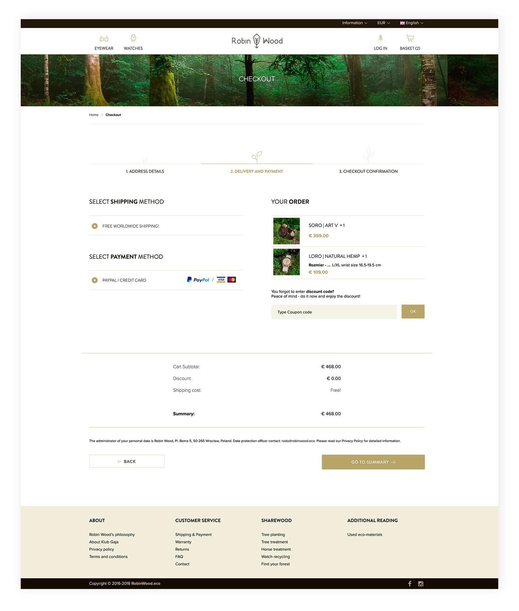


Robin Wood’s online shop needed to reflect the brand’s values, visual identity and deliver the best user experience based on our target audience’s expectations. The colour palette (dark brown and gold) was a minor part of the design, which had its main focus on imagery, to evoke the feeling of being close to nature. Horizontal, panoramic pictures are metaphorical depictions of never-ending horizons, space and freedom. A recurring element of the brand’s messaging included an invitation to “Robin’s forest”, which is strengthened with images portraying pure and wild landscapes full of trees.
Employing white spaces strategically, helped enhance the additional perception of spaciousness and the minimalistic design highlighted elements that were most vital for users.
The navigation was made to be simple and provide instant access to all the products and relevant information (from the product’s description, to its sizing, used materials, as well as, eco-initiatives aided by the purchase). As 67% of all users used mobile phones to visit the website, the e-shop is fully responsive, so as to meet their requirements.