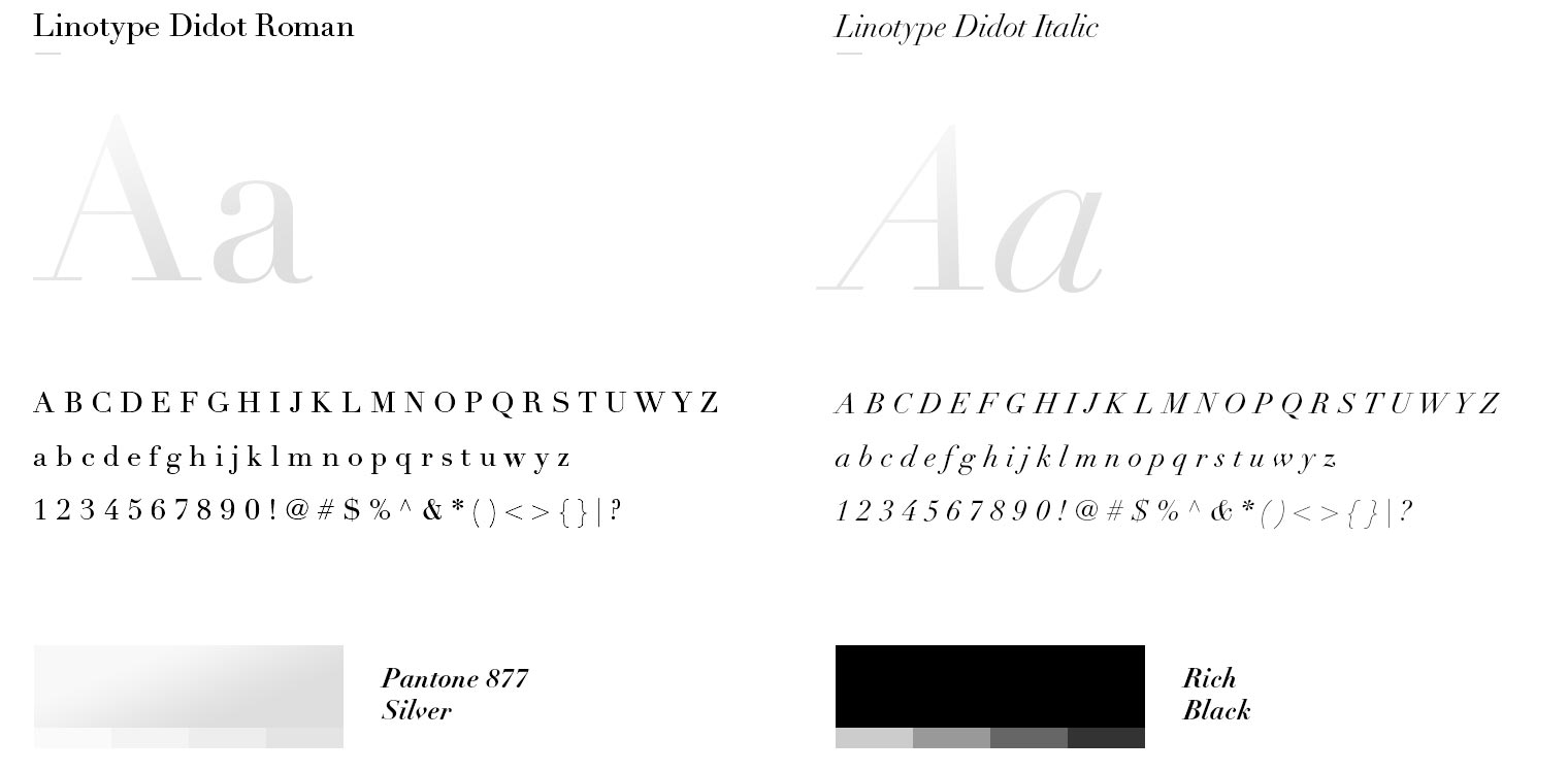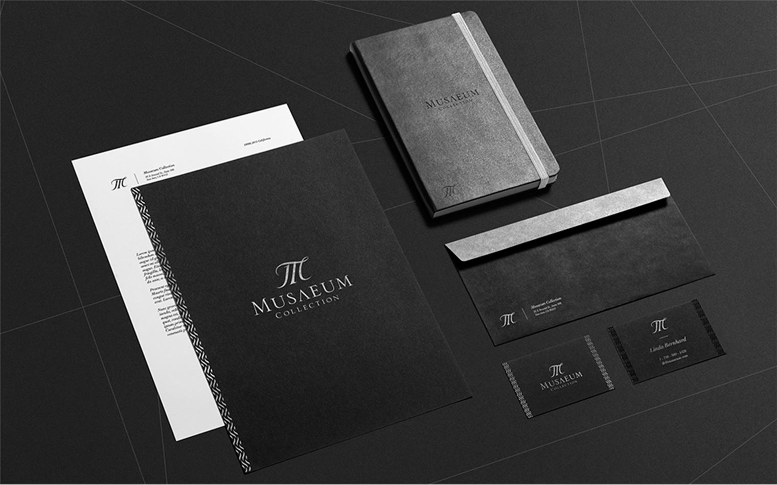


It’s a unique and sophisticated place with collections of art and antiques. You will not find a single ordinary thing in there. That’s why the visual identity had to be minimalistic, elegant and emphasized by some sophisticated symbol. The design couldn’t be dominated by any clearly defined style because of the wide range of different art pieces and furniture. The target group loved luxury and CI had to show that Musaeum is the right place for them.
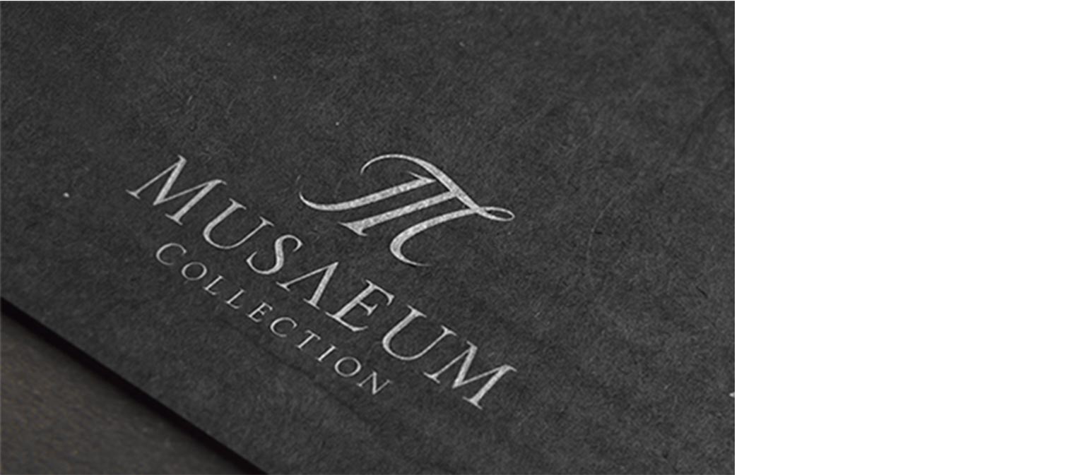
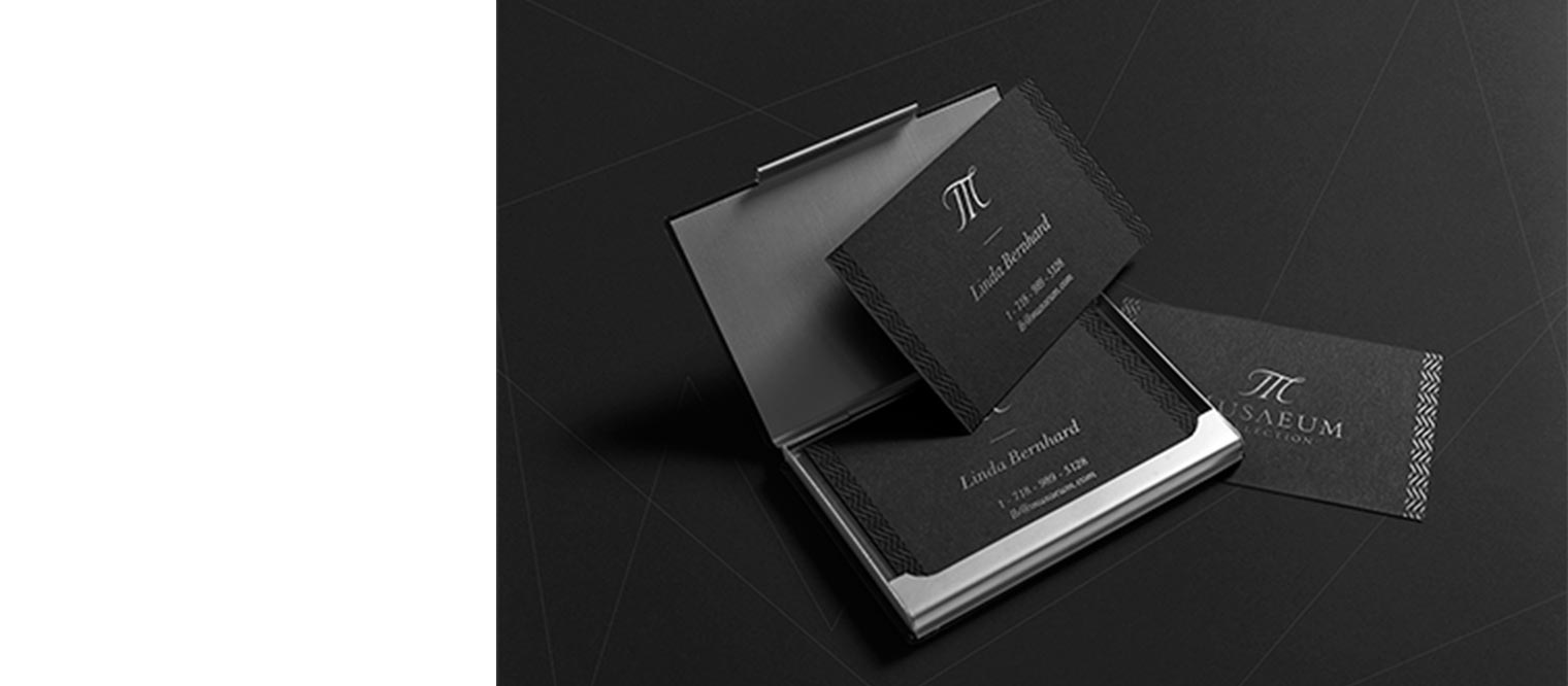
The symbol is a combination of the first letters from the company name (M&C) and the shape of a classical museum building, to communicate the company’s area of activities. Long, cursive serifs make the whole symbol more elegant and sophisticated. Silver adornment on one side and embossing on the other gives this visual identity a classy look, especially on the deep, black background with silver letters.