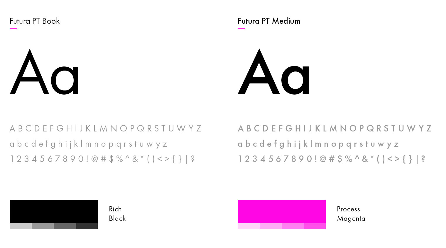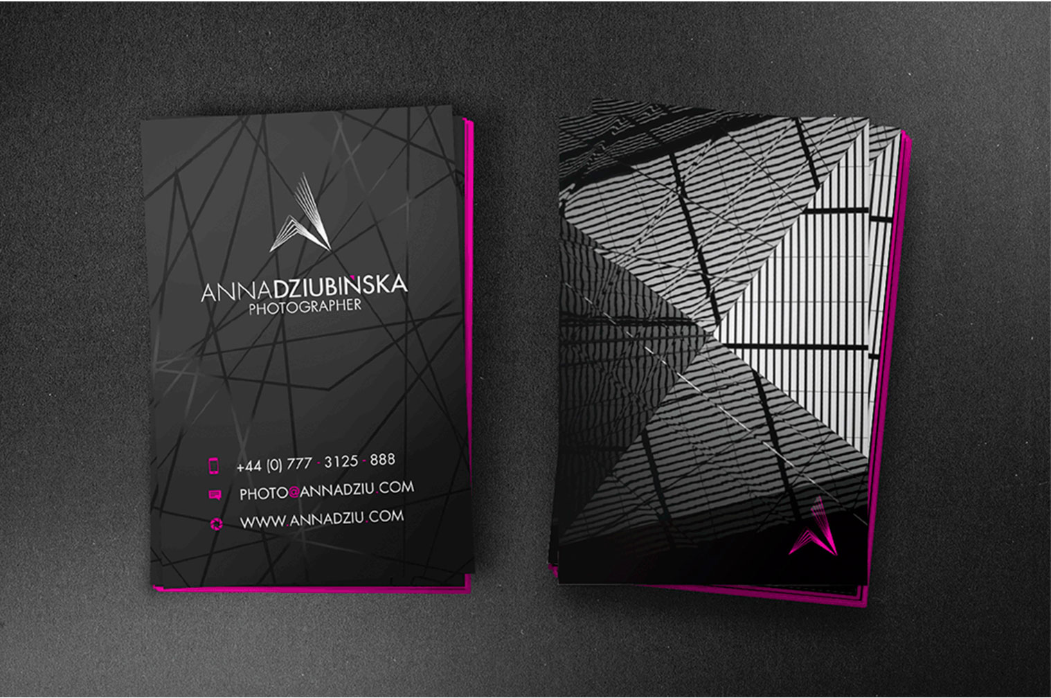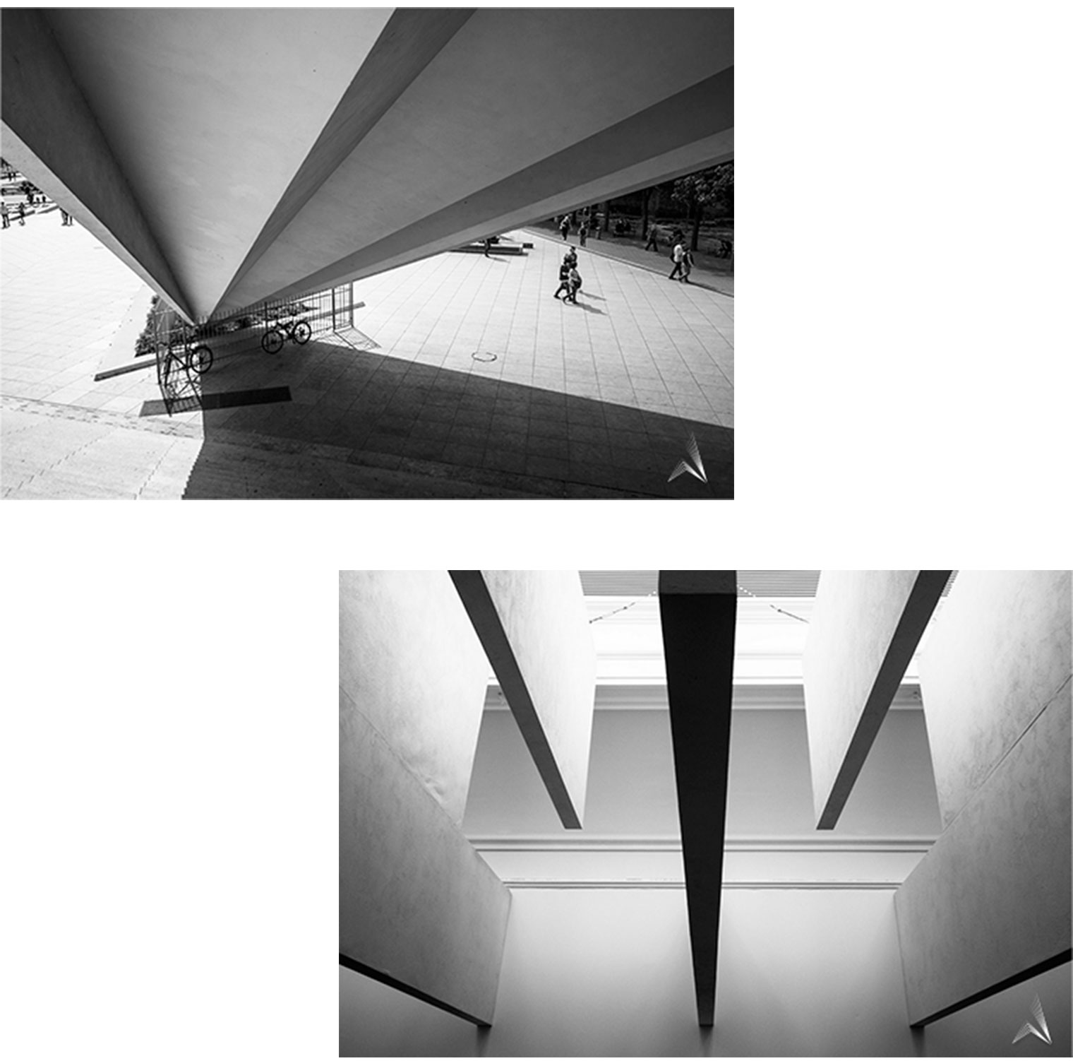


Having a unique style is one of the most important things to become recognizable in the area of architectural photography. It is also a basic value in creating a great personal brand. In this case the main objective was to find the best visual way to show Ania’s outstanding style, professionalism and personality. At the same time, she wanted her sign to be abstract, without any simple and obvious connection to photography or architecture. Additionally, her symbol as a watermark has to be consistent with her photographs not to create any visual dissonance.
This design is about style and visual experiment which reflects Ania’s works the best. A mix of lines, perspectives and her favorite shapes are closed in a letter “A”. It’s all about her and the way she works. The whole identity is focused on this ‘something more” which brings you the world of her photos.