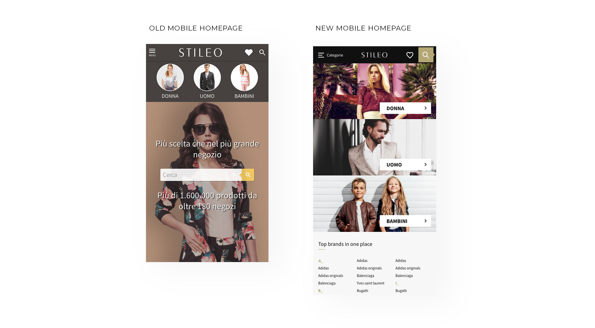
Stileo
Product design & UX case study
Project overview
Stileo.it is the biggest online fashion aggregator in Italy, recording 26 million unique users per year. For its customers, it serves as an online fashion house where they are able to easily search through millions of products that are available in other on-line shops. For Stileo Partners (B2B), the platform is a valuable source of new, high-conversion traffic.
Responsibilities
- Leading the entire website redesign process
- Running different workshops
- Running user research and creating personas
- Information architecture & user flows
- Designing an entire design system using atomic design
- Collaborating with analysts to build and improve ways of collecting data (Google Analytics, HotJar)
Goals
- Redesign of the entire website
- Creating new information architecture for key navigation
- Optimizing users’ critical paths
- Gathering users’ feedback & data in order to iterate the product
- Designing scalable and easy-to-use design system
- Increasing CTR wherever possible 🙂
Other challenges
The biggest challenge in redesigning and developing a website like Stileo is its complexity. Internet aggregators are characterized by high traffic (26 million users annually in the case of Stileo), a high level of optimization of user paths and a huge emphasis on performance marketing. Each UI/UX change affects a number of marketing indicators to the extreme that sometimes shifting an element by just 10 pixels can reduce the partial CTR by up to several percentage points.
As well we had to take into account the numerous technological limitations resulting from the way the website was programmed.
In addition, strict SEO requirements had a big impact on every stage of the design process… in a very challenging way 🙂
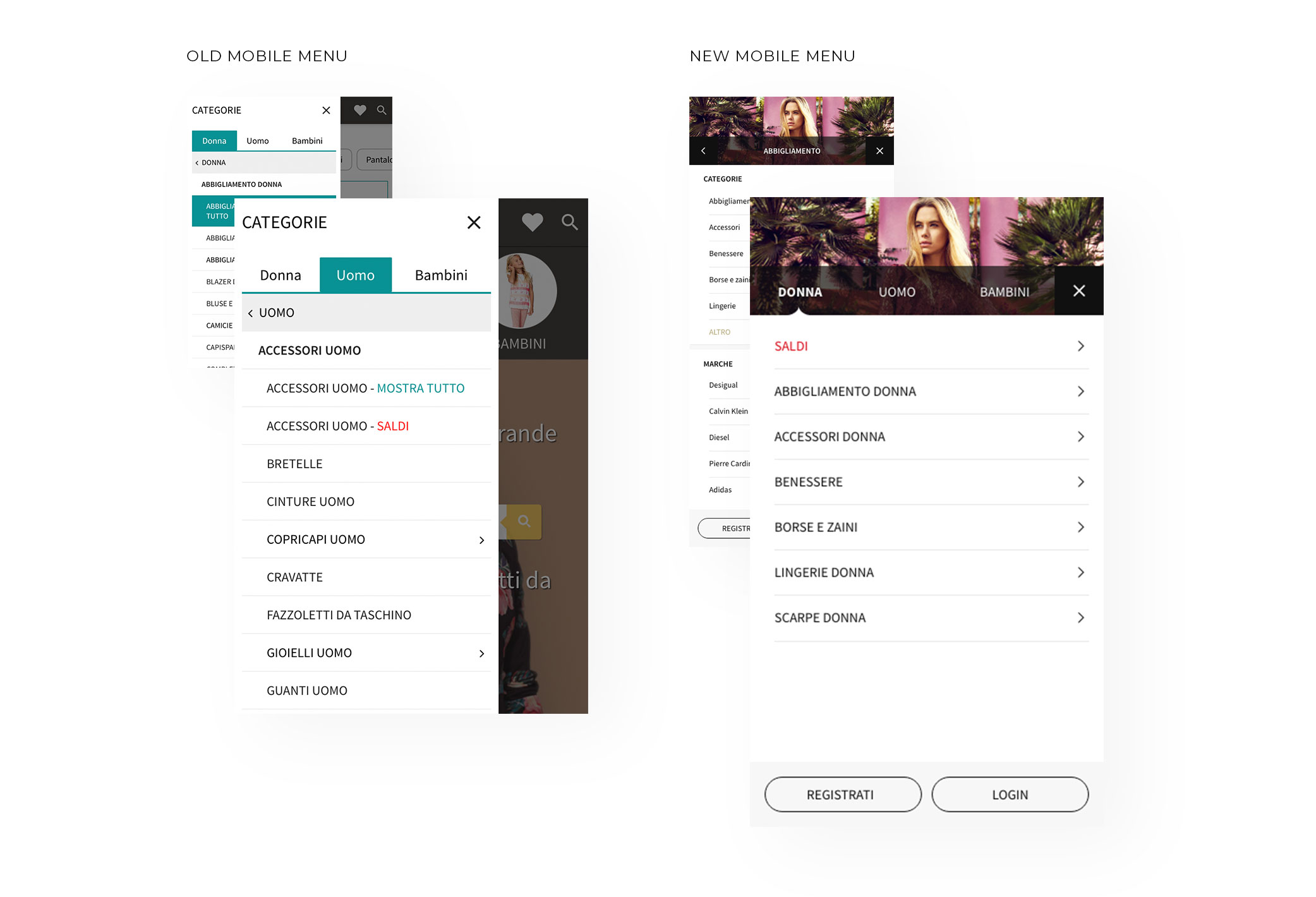
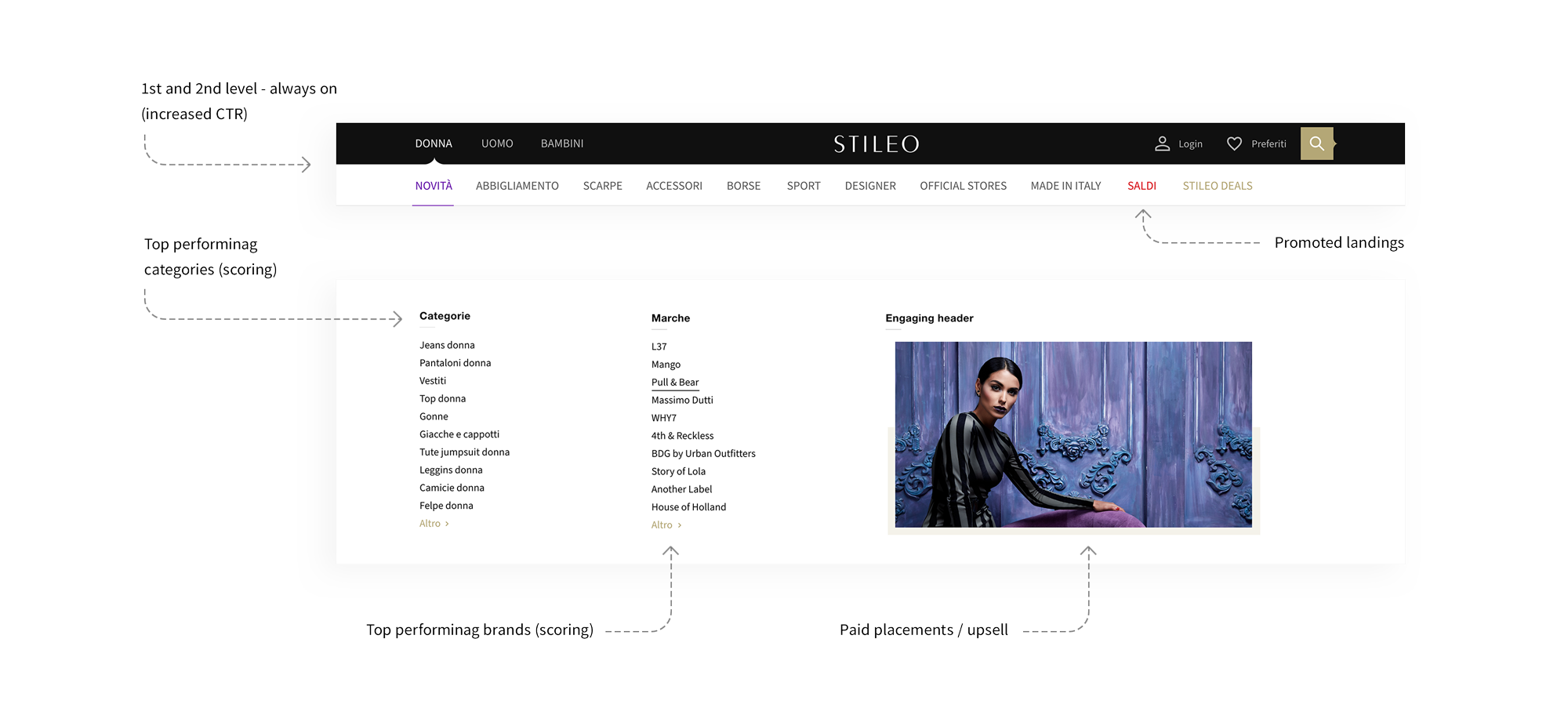
Menu redesign
Context
Web aggregators are built of few types of subpages, but each of them must be optimized to the maximum.
The key parts of these websites are complex navigation and extensive filters. In the case of Stileo, both had to be correlated with the already existing category tree covering hundreds of thousands of products.
The solution that existed at that time mixed the features of the products with their categories.
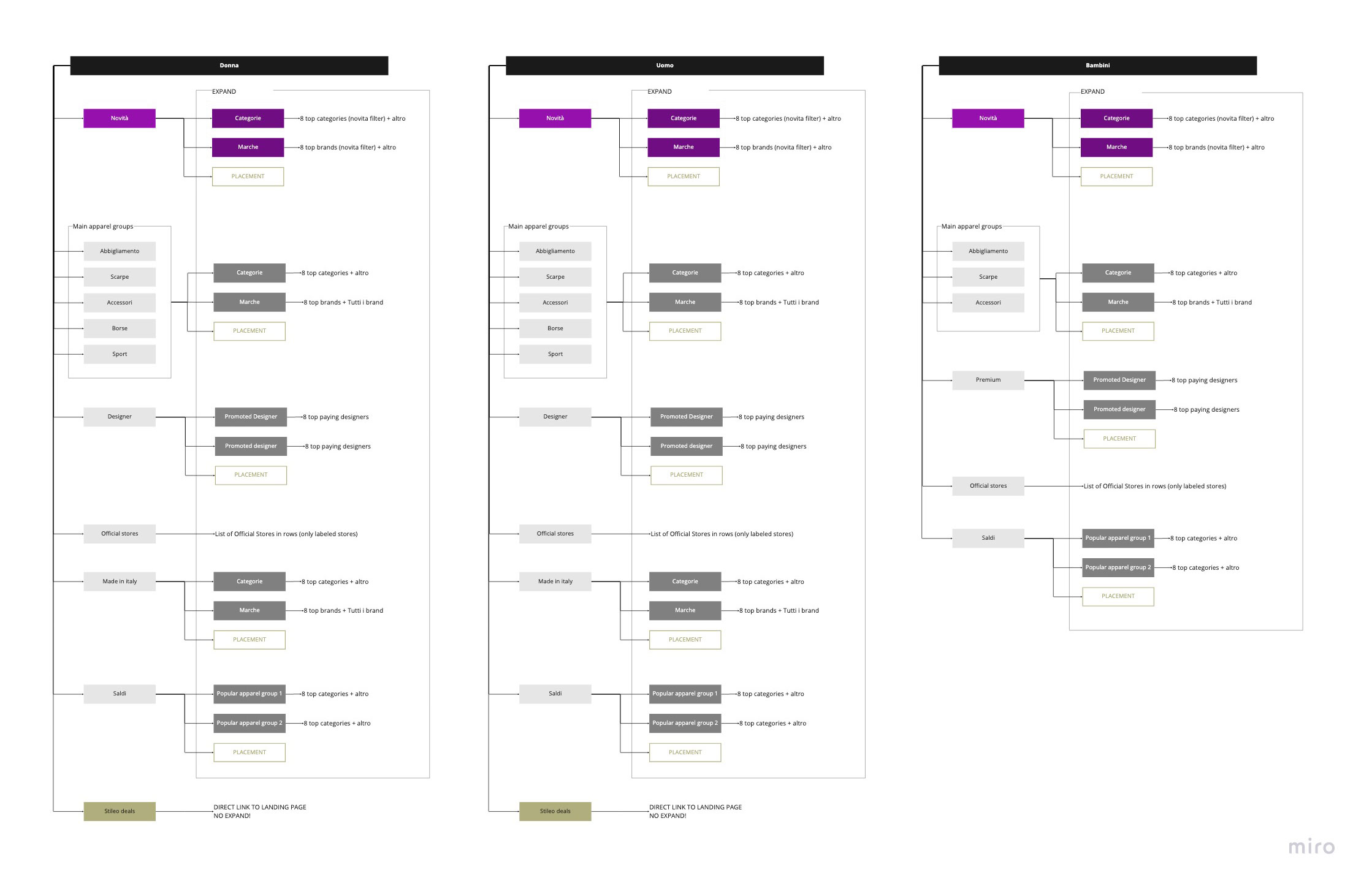
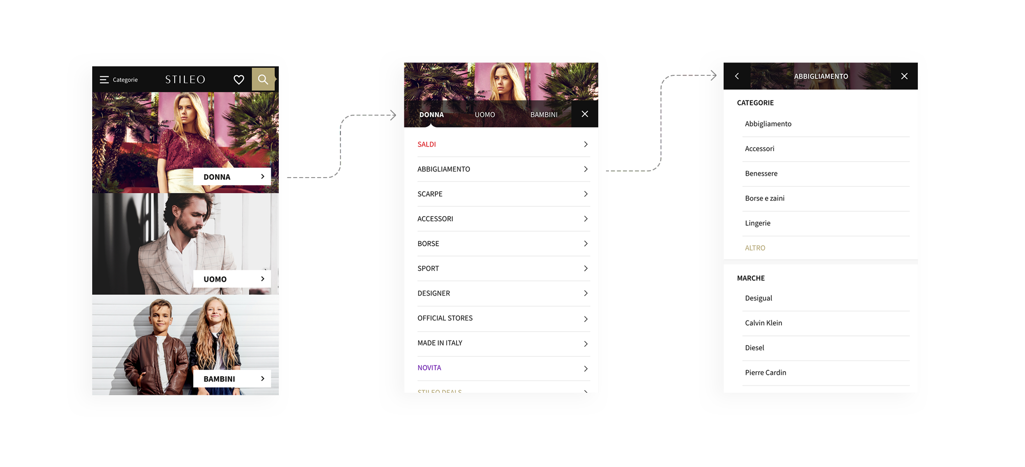
Information architecture
Filters redesign
Context
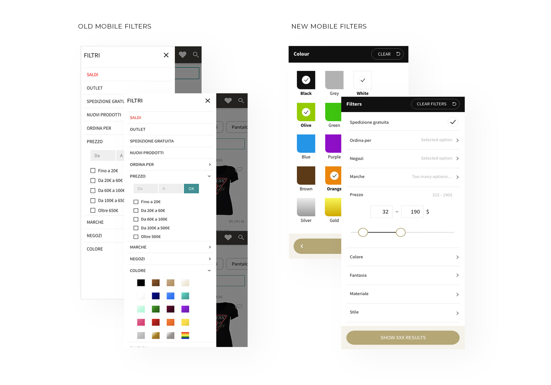
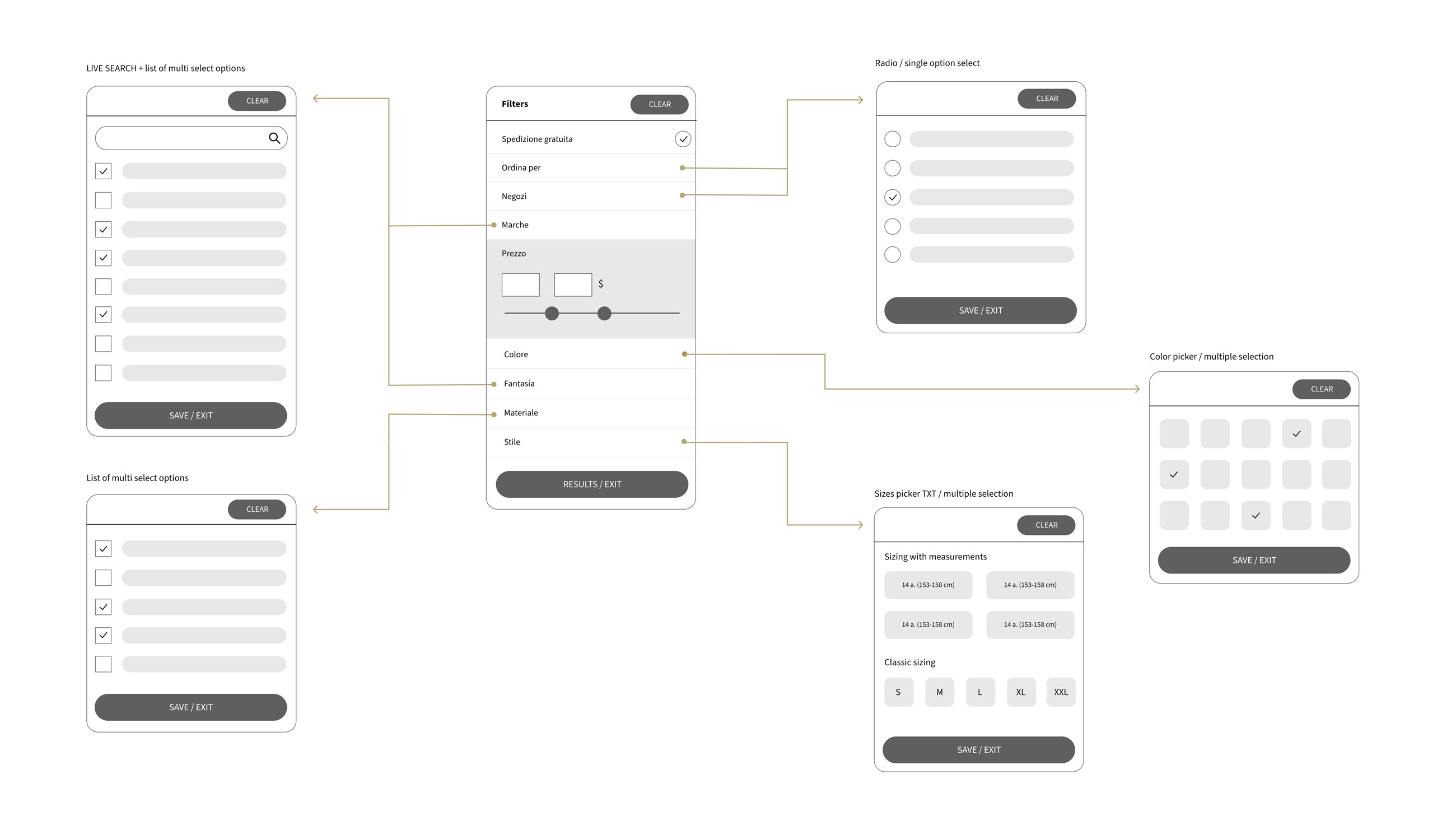
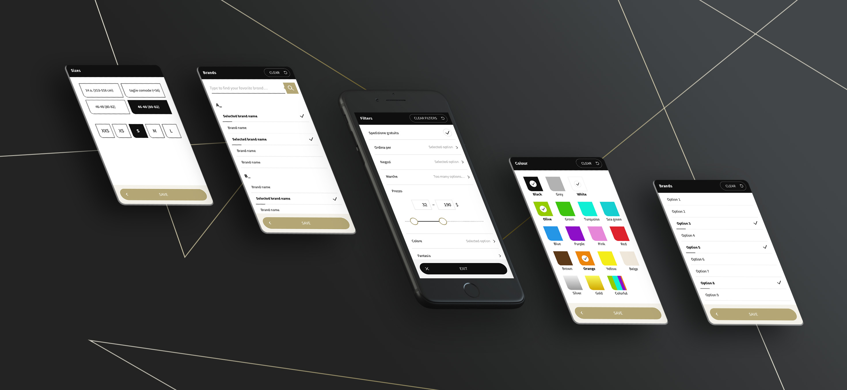
To redesign the filters, we primarily used user behavior recordings and very detailed data from Google Analytics. Conclusions were worked on in workshops and implemented for testing in several iterations. As a result, it was possible to increase the GMV by 3.7% thanks to their reconstruction.
Due to technical limitations desktop filters had to remain in the side panel instead of going to a sticky bar above the listing.
Design system
Atomic design
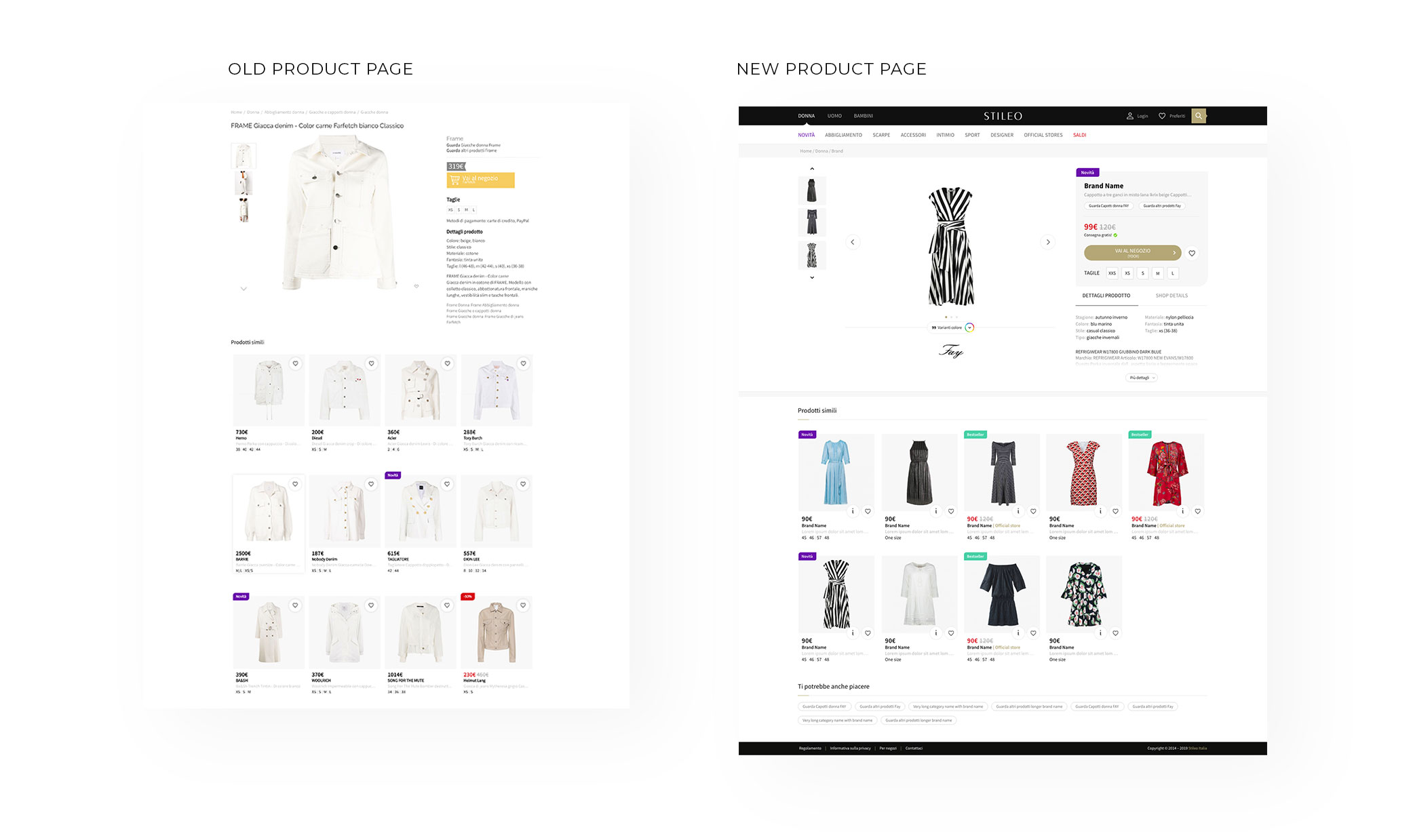
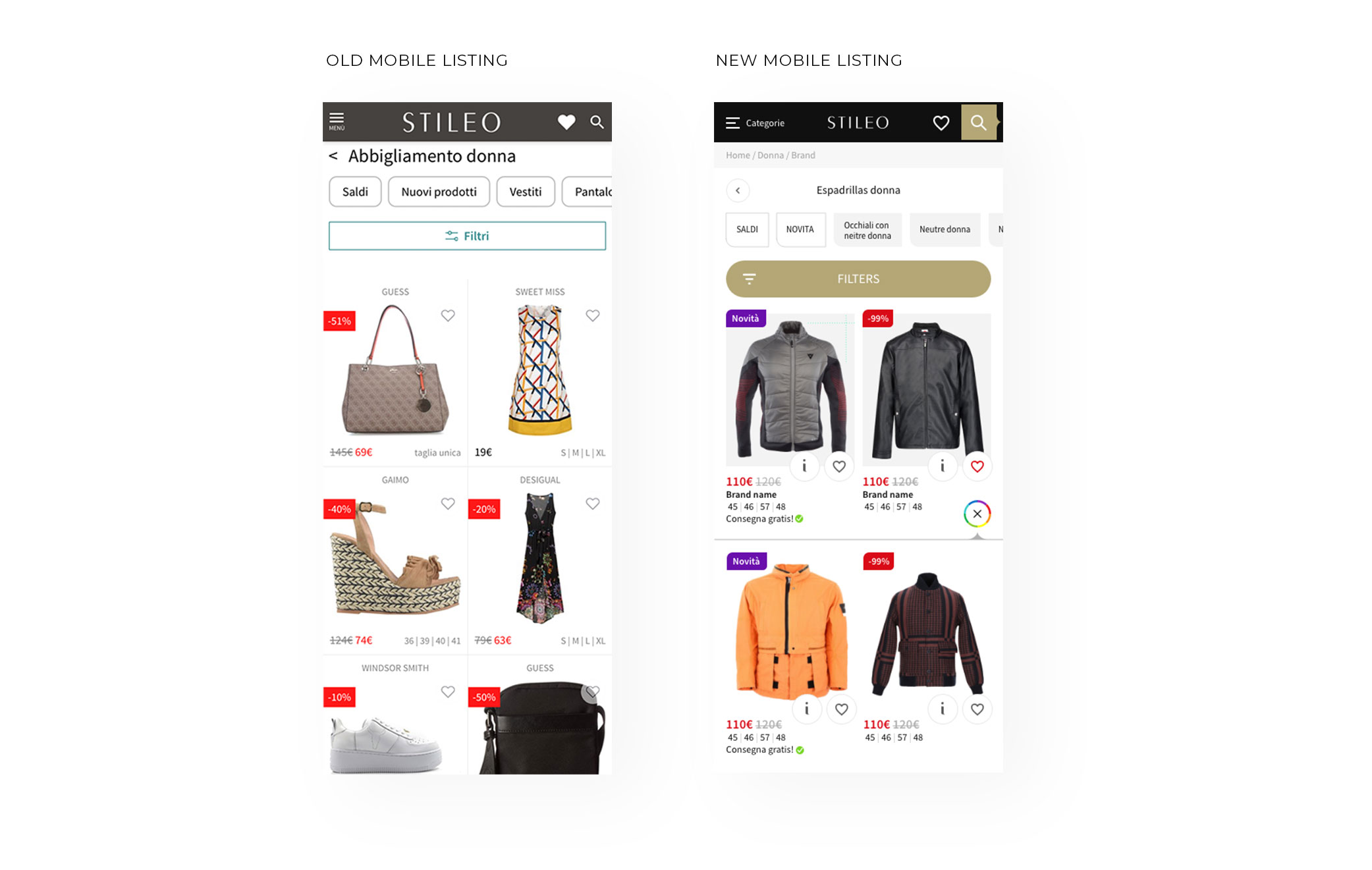
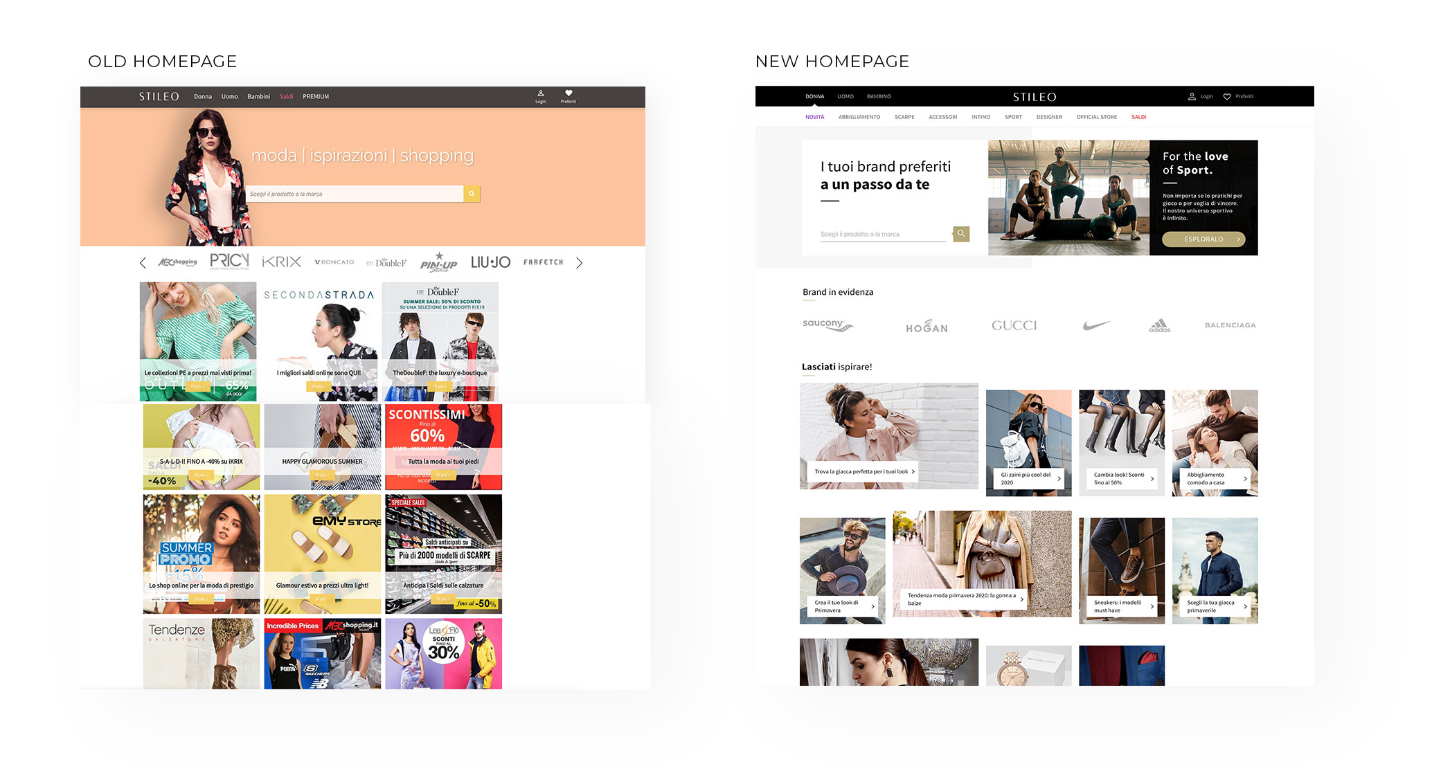
Parallel to the created product solutions, a branding strategy and a new website design were developed. Consistency of UI elements will always bring value to users.
Every element of created design system was carefully measured and adapted to the information architecture and SEO requirements for each of the subpages so as to maintain its consistency at the same time.
Testing framework
Each designed solution was always tested in 20/80 and 50/50 splits before being fully published. Even though every pixel mattered, I still managed to bring more of a fashionable look to the design. All of those changes, complemented by fashion photos, a minimalistic design and a new approach to copywriting brought value that we observed, not only in raw data but in new possibilities that resulted from each iteration.
Results
Partners began to perceive Stileo as experts and noticed its markedly closer alignment to the fashion industry. Users’ perceptions of the brand similarly changed. The new design became the complimentary background that emphasised the Partners’ brands. A brand’s perception is always connected to the moment the brand touchpoint occurs, which previously meant that many premium brands were unable to use Stileo’s services. After changes were introduced, Stileo was able to acquire these Partners and the change in design became a strong value proposition.

